Project context
FNPS hosts an extensive database of Florida's native plants
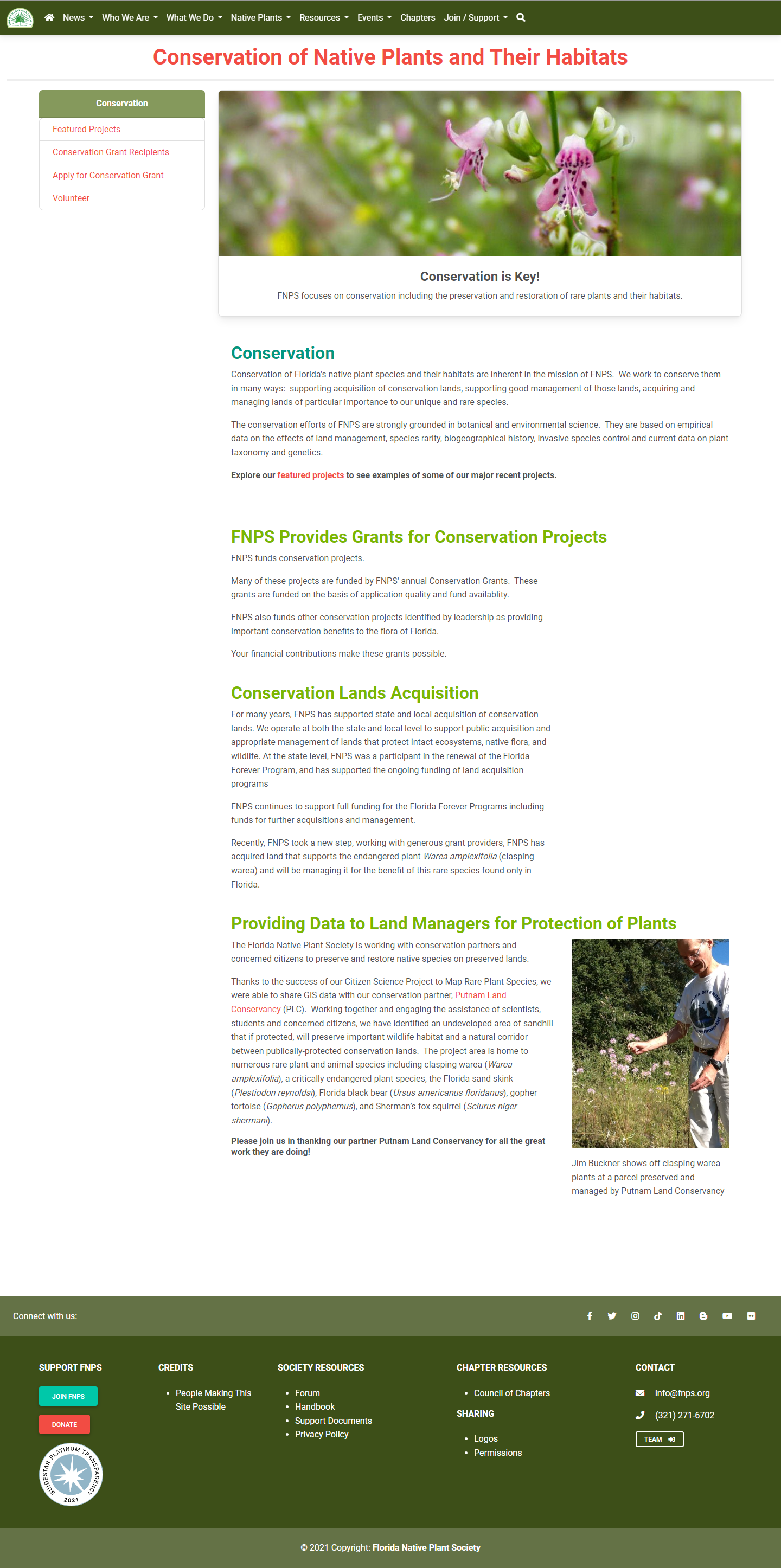
The Florida Native Plant Society (FNPS) is a non-profit organization dedicated to preserving Florida's remaining natural places and conserving the plants that call them home. Their database serves as an excellent resource for gardeners and landscapers looking to add some native plants to their projects. The plant database accounts for about 75% of their web traffic.
The problem
The FNPS plant database may be too intimidating for less seasoned gardeners
While visitors may be interested in planting native, the FNPS plant database doesn't make it easy.
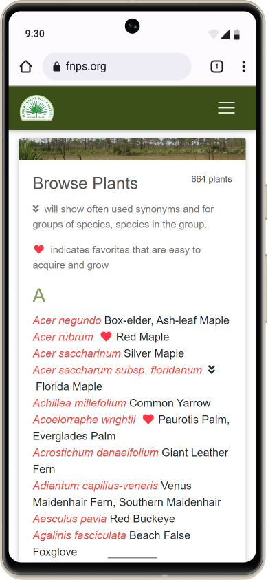
Visitors have very little information to help them decide what plants to click on. The list is just text, with no pictures or supplemental information about each plant. Less experienced visitors may feel lost and give up.
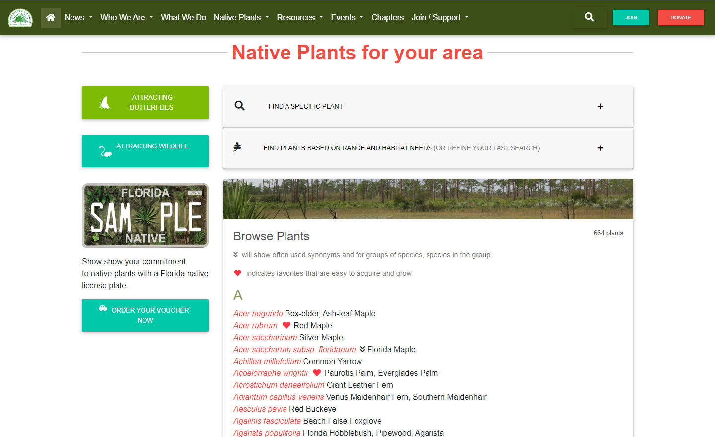
For FNPS, encouraging people to plant native is part of their mission. The database is a great resource, but for it to be effective at getting folks to plant native, it needs to be easy for gardeners of all backgrounds to find what they're looking for.
What could be done to increase the likelihood of a visitor finding the right plant in the database for their garden or landscape?
The opportunity
Does the plant database hold the key to growing membership?
A colleague once described the plant database as a “gentle trojan horse” for the FNPS mission. Several members of the web team (myself included) have similar stories of stumbling upon the FNPS plant database, adding some natives to the garden and being amazed at how much livelier it becomes—an Aha! moment. We're all now paying FNPS members and actively working to further their mission.
A successful redesign of the plant database could help our visitors have their own Aha! moments.
Key design goals
Beginner friendly
Entries in the list should include enough information to meaningfully describe each plant.
Provide relevant, actionable recommendations
The goal is to help visitors find the right plants for their needs. We should prioritize plants that they can actually find.
Maintain full functionality
The database has powerful filters. We want to make good use of them.
Scannable at any size
The database should look nice and make good use of space on all screen sizes.
My role
UX Design, User Research, Design System, and Branding
Exploration
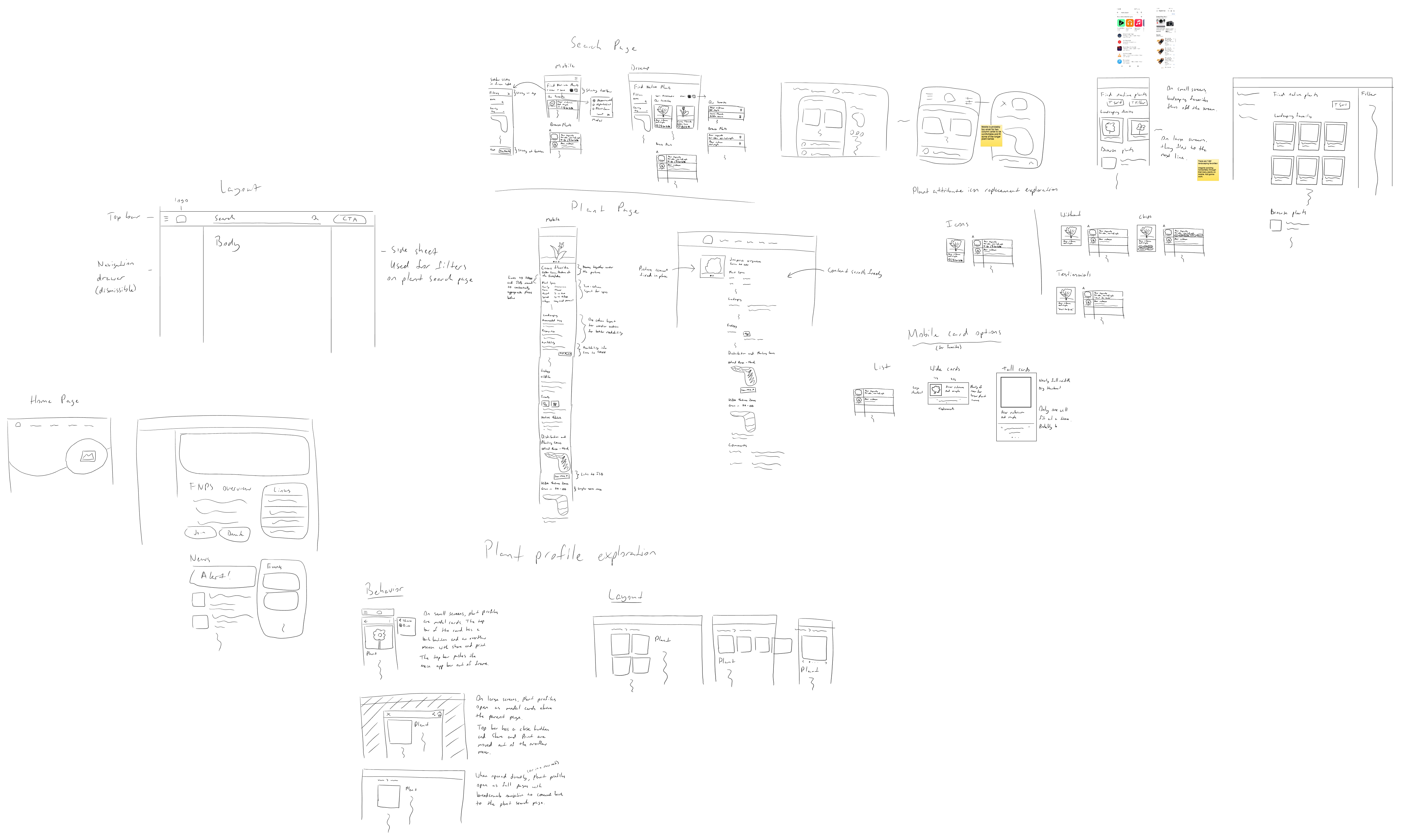
Sketches
I like to sketch out ideas at both the macro level and the micro level. For this project, I explored different page layouts for the plant database, plant profiles, and home page, as well as different approaches to enriching and presenting database entries. I played with different ideas for interactions and transitions, too. For example, what if the plant profiles opened as modals to make it quicker to check plants?
Research
Card sort testing reveals new subgrouping for plant profiles
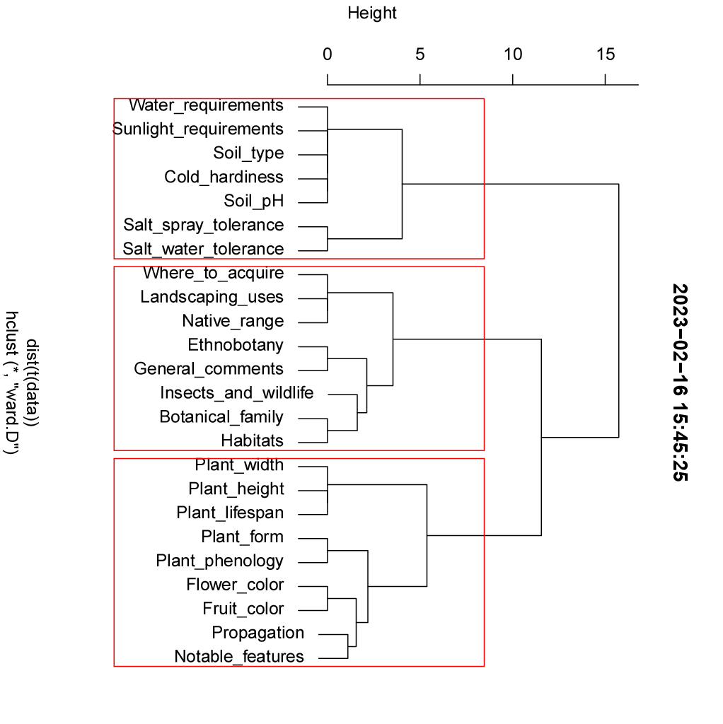
The plant profiles had lots of information about each plant, but the arrangement wasn't ideal. I took all the data points from the plant profiles and used an open card sort with a few users to see how they would group them. Though the sample size was small, there was strong consensus among users, so I was still able to get some useful insights out of it.
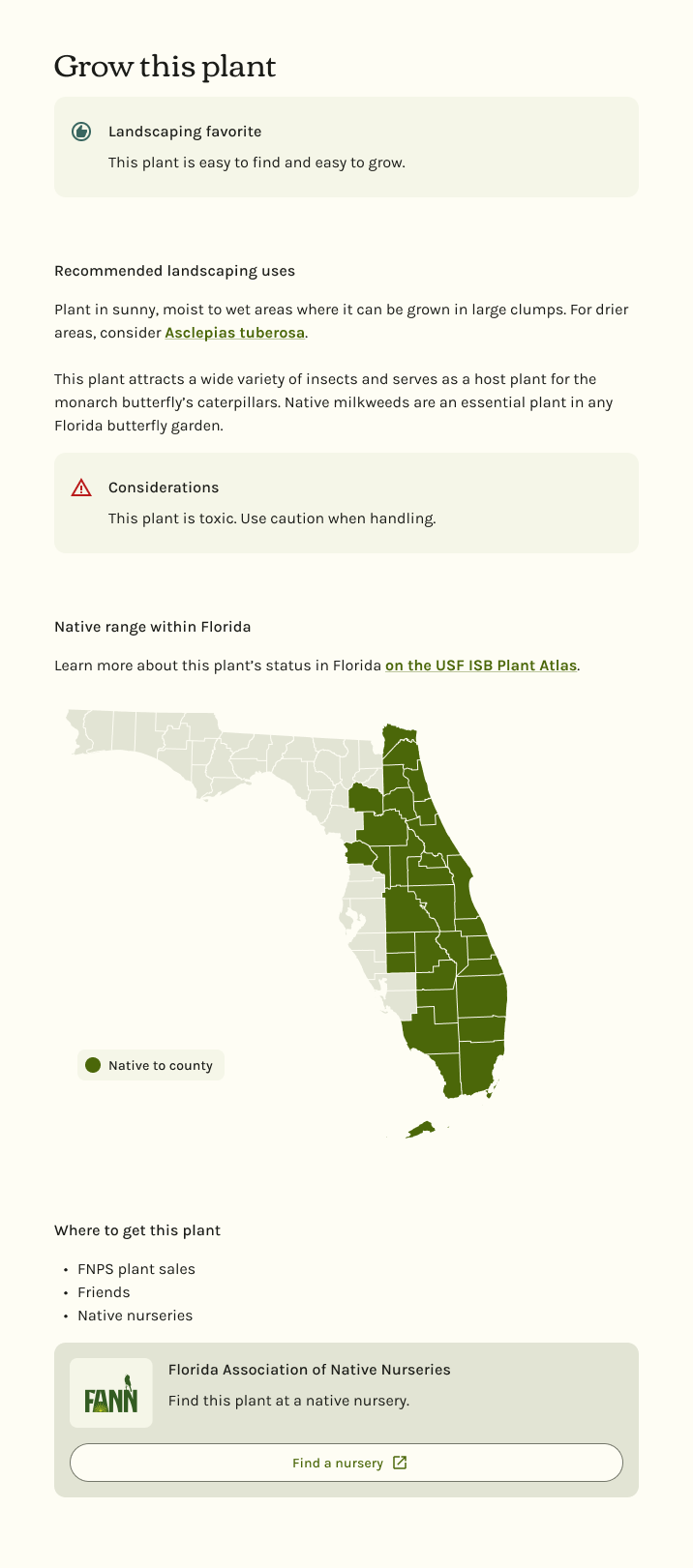
Running statistical analysis on the results revealed three main groups of information, which I labeled Site Conditions, Ecology, and Plant Specs. Within the larger ecology-focused grouping, an interesting subgrouping emerged. All participants grouped: how to use it, where it grows, and where to get it. This led to a new, more actionable section on the plant profile called “Grow this plant” that attempts to answer the question, “Is this the right plant for me?”
I used the card sort results to help me rearrange the rest of the plant profile as well as the list of filters for the plant database.
Design
Making the plant database as easy to browse as a garden center
Software design often borrows from the real world to make things more intuitive for users. Computer operating systems, for example, borrowed terms and symbols from the office environment familiar to their users. Similarly, I wanted to make browsing the plant database feel more like browsing at a garden center.
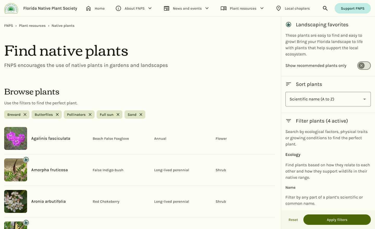
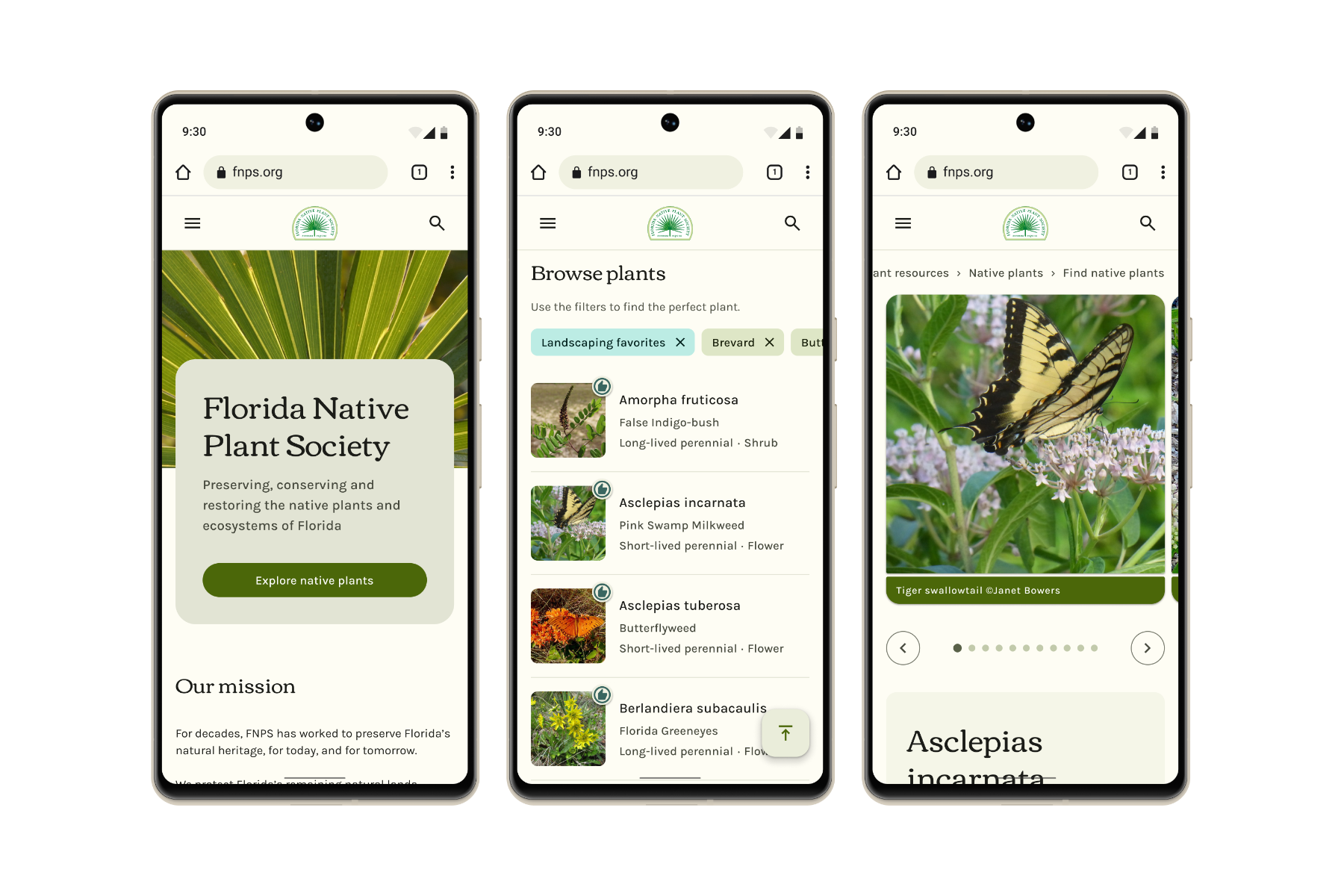
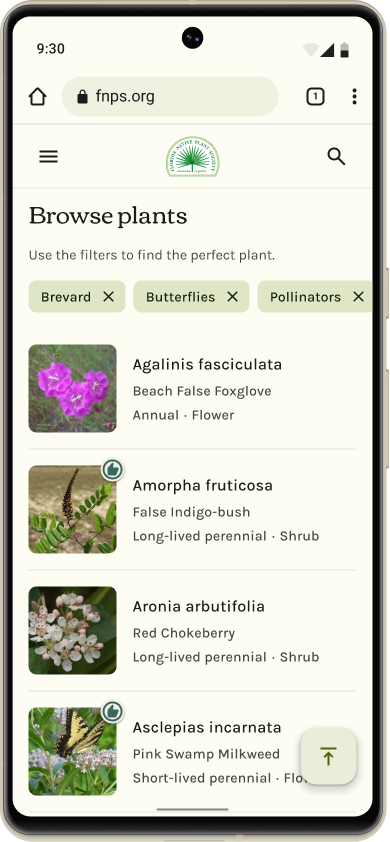
More scannable entries now include a picture and landscaping-oriented details to help visitors decide what to click
The most important change here is the addition of a picture for each plant. Walking through a garden center, the eyes are drawn to the physical features of each plant, whether it be their flowers, their foliage, or the insects that visit it. One little photo can say a lot about a plant!
I also included the lifespan and form of each plant because that's how garden centers usually organize their inventory. First, by form (shrubs, trees, flowers, etc.), then, for flowers, again by lifespan (annual or perennial).
On desktop, plant entries spread out into a breathable, tabular layout. On mobile, entries are stacked instead of wrapping to the next line. Each piece of information is consistently located from plant to plant. No more awkward line breaks!
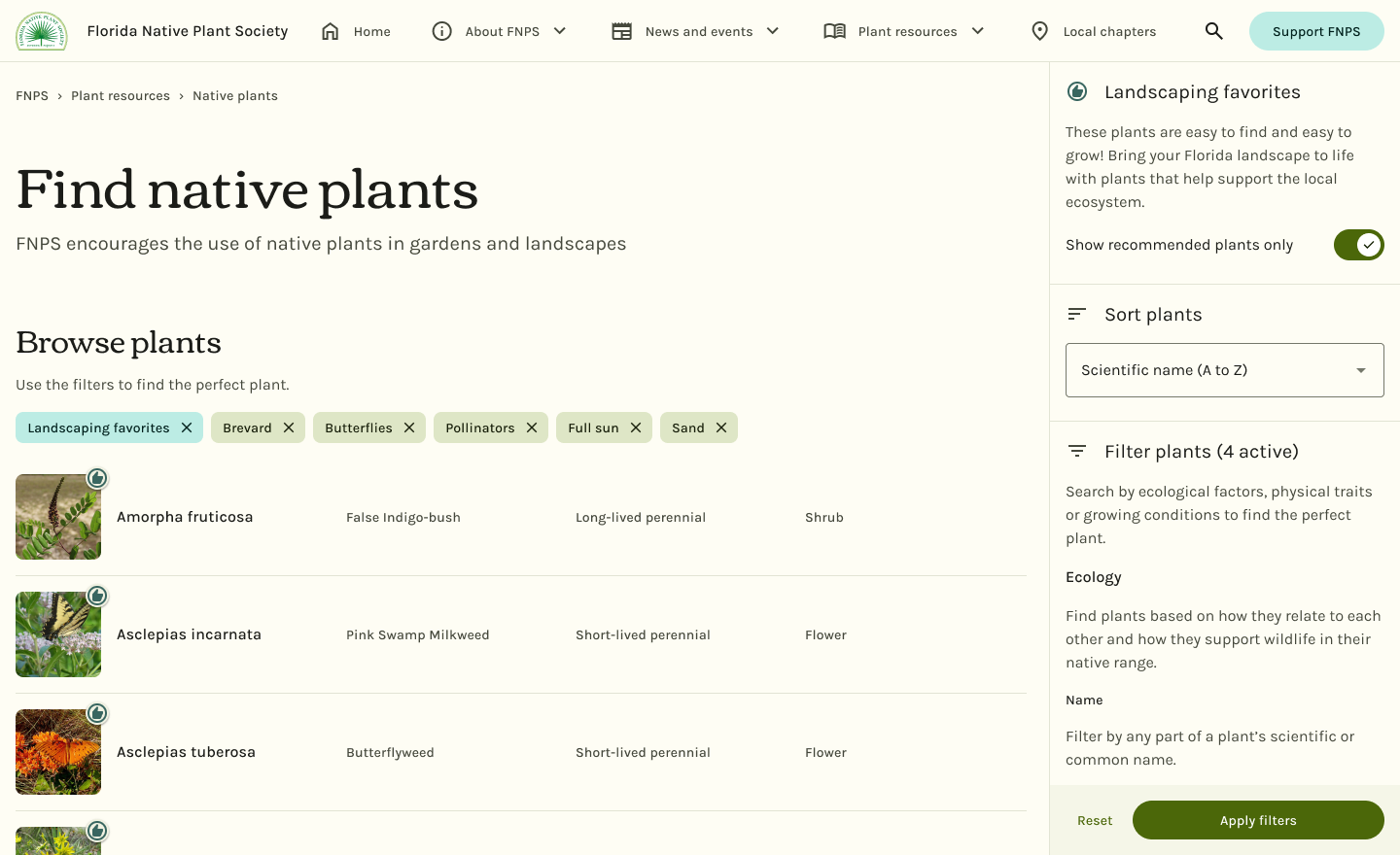
Providing actionable recommendations by elevating Landscaping Favorites
Landscaping Favorites are plants that FNPS says are easy to find and easy to grow. They were marked with a heart on the list, but there was no way to filter for them.
Landscaping Favorites have been elevated from a footnote to the stars of the show. A toggle switch above sort and filter hides the rest of the plants so landscaping-oriented visitors can focus on just the plants they're most likely to be able to find and grow. This makes it easier for visitors to find actionable recommendations and helps FNPS by getting more ecosystem-supporting native plants in the ground instead of non-native contractor specials from Lowe's.
The redesigned plant profiles use research insights to streamline the vetting process
Once someone finds a plant that catches their eye, they need to make sure it's a good fit. The new plant profile is more actionable, with the most relevant information for gardeners and landscapers front-and-center.
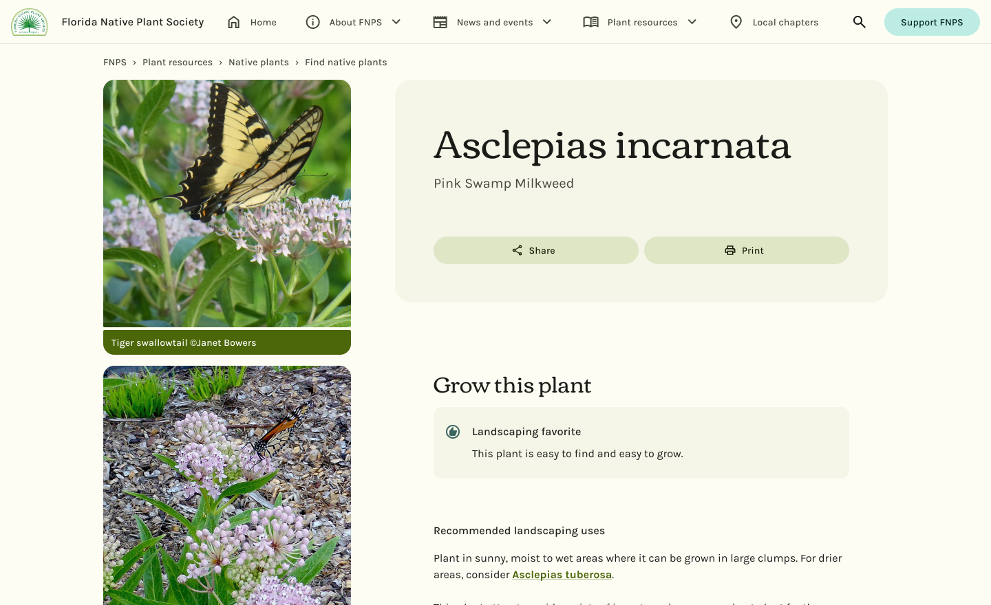
“Is this the right plant for me?”
Using insights from the card sort results, I rearranged the plant profile to try to answer that question as quickly as possible.
The page begins with a new section, “Grow this plant”, which includes recommended landscaping uses, the native range of the plant, and where it can be purchased (with a link to the Florida Association of Native Nurseries to find a local place that carries it).
If applicable, a banner marking a plant as a “Landscaping Favorite” appears at the top. Previously, plants were only given this designation on the plant list.
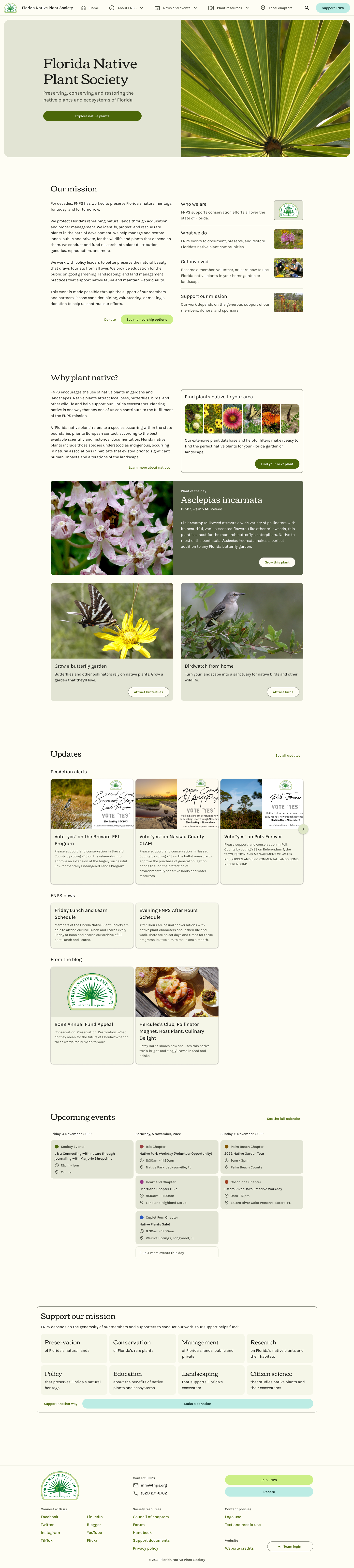
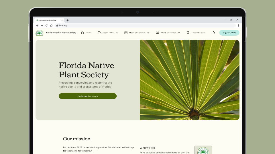
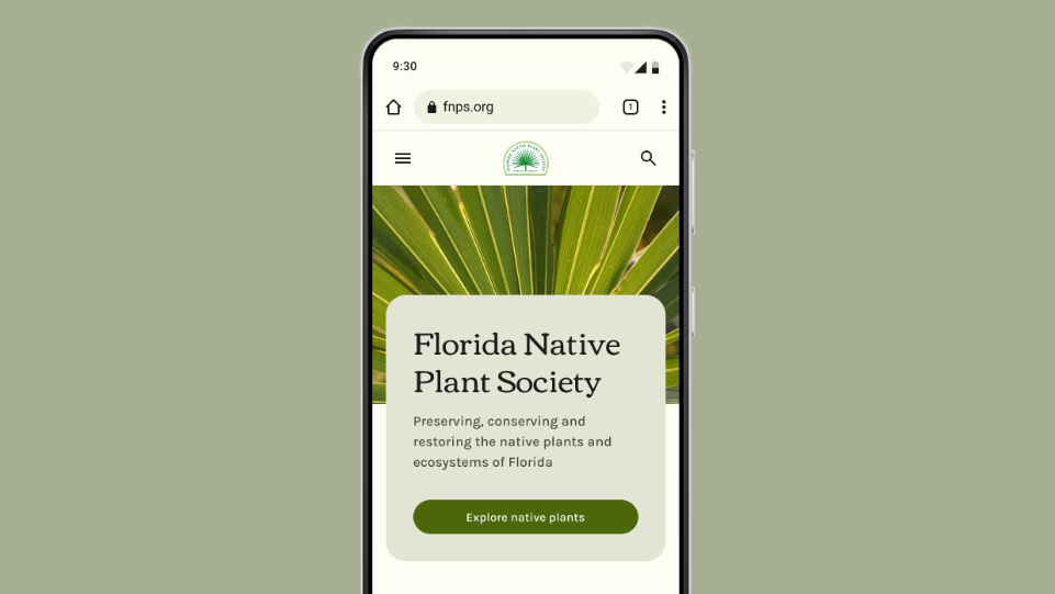
A more helpful home page
The home page serves as the reception area of the website, but the original home page was unfocused and lacked a clear hierarchy.
Since the plant database already receives most of the web traffic, the redesigned home page puts it front-and-center. This space could also be used as a carousel for big events, such as the annual conference.
Better content design and interconnectivity creates a more engaging reading experience
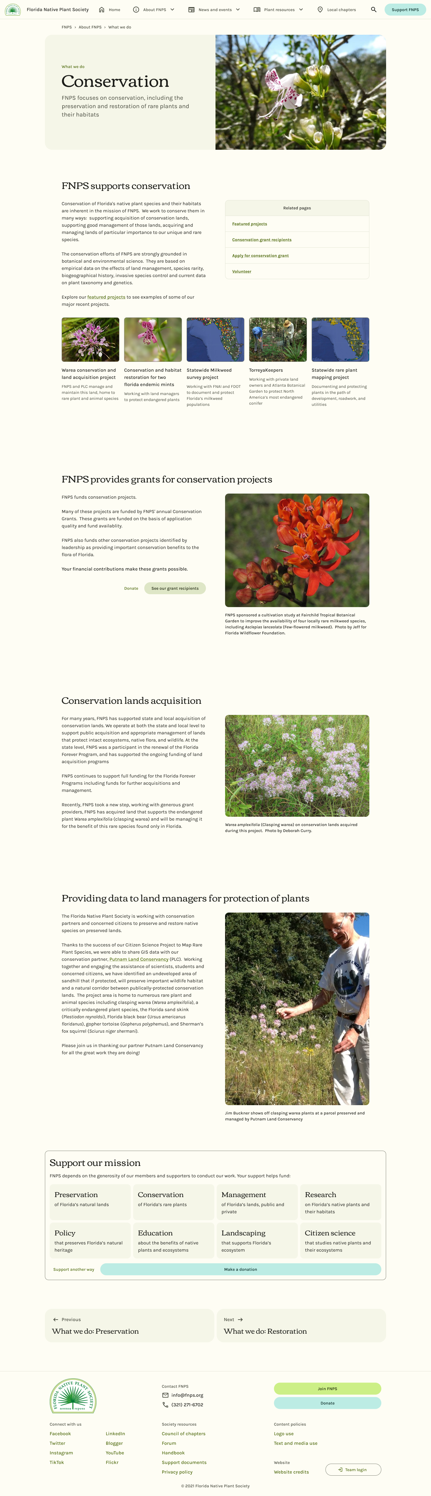
Static pages like those in the About section weren't a major area of concern, but I wanted to redesign a representative page for the less trafficked parts of the website.
About pages now include relevant images, pages, calls to action, and lateral navigation for further reading.
Originally, the related pages table from the desktop sidebar sat at the very bottom of the page on mobile. It's now part of the main content flow, after the first section, where it's more likely to be seen.
Information architecture
Less clutter in the navbar
Top level navigation items were consolidated, where appropriate, to reduce the number of items in the navigation bar.
Navigation items related to membership or donating were consolidated to a single “Support FNPS” call-to-action button and moved to the far end.


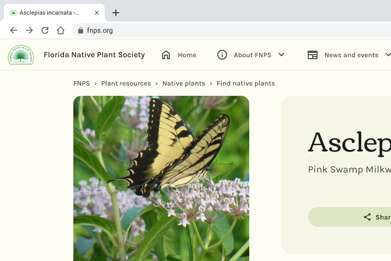
Breadcrumbs
Nested pages, like plant profiles, now include Breadcrumbs at the top so visitors linked there directly can find their way back to the parent page.
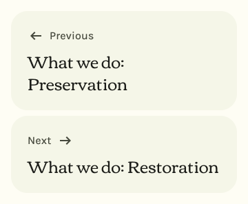
End-of-page navigation buttons
New navigation buttons let visitors step through sibling pages or return to a parent page. For example, moving to the next page in a section or returning to the plant database from a plant profile.
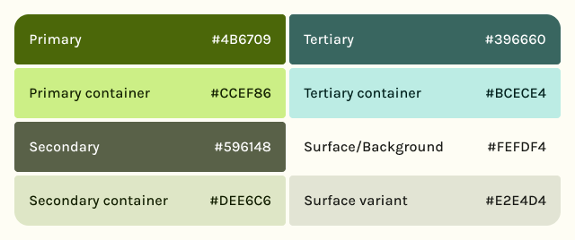
Design system
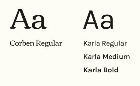
A fresh coat of paint with new typefaces and Material Design 3
The original website used the Roboto typeface and Material Design 1 aesthetics. At first, I only used the new Material components library to speed up prototyping in Figma, but I liked how it was coming together, and FNPS liked the new look, so it seems to have stuck for now.
Corben (for headings) and Karla (body text) have similar bones and pair beautifully. Sans serif typefaces like Karla work well for smaller text on websites since they render well even on low-pixel density screens.
Prototypes
Screenshots not enough? I also made click-through prototypes at desktop and mobile breakpoints, if you'd like to see what the redesign would be like to use.
Reflection
Ideas can sound great in your head or as isolated sketches, but sometimes you don't realize that they aren't practical until you prototype them.
There were so many ideas I had for how to enrich the entries of the plant database that had to be scrapped. I started with sunlight requirements and what wildlife the plant attracted; notable features from the profiles like “showy flowers” sounded good, too. At one point, I was even making custom icons for the animals because the ones FNPS already had were a bit too detailed for smaller sizes. But putting all these things on the list entries just added clutter.
At one point, in my effort to elevate them, Landscaping Favorites were going to be a lane of cards above the rest of the plants. There are 156 landscaping favorites in the database. Imagine scrolling through that — horizontally — on a phone. And if that wasn't bad enough, some of the scientific plant names have subspecies so the whole thing is like a run-on sentence. They really needed their own line and as much width as the screen would allow. Narrow cards were out. Grids were out. Lists were in!
I needed to think big picture while accounting for edge cases.
I also learned to really appreciate research — not just for the insights, but more so the peace of mind it provides. When I was unsure of how to order the filters, for example, I could lean on my plant profile card sort results (which contains largely the same categories). Instead of hemming and hawing over what should go where, I could just look at my data and be done and stop worrying about it. My only regret was not doing that research sooner.
What's next?
This project is ongoing and began with limited research. The dev team is still figuring out what stack to use for the broader modernization effort of FNPS.org, so before development begins in earnest, I want to go back and do more research with users to make sure we're on the right track and addressing all potential issues.
This portion of the project focused on the plant database, but the second most visited section of the website is the newsletter and magazine archive, which I haven't even touched yet. There is much to do!
FNPS has no client-side analytics in place on the existing website. All I have to work with is server-side stats (mostly just page view counts), so I have some data blindspots. I'm pushing for something more comprehensive so I can watch user sessions to see how people typically interact with the plant list. I need that context to be able to predict how a successful redesign will impact metrics. Does the lack of context about each plant make people click on more plants because they have to, or fewer because they don't know where to start?
While I'm confident that what I've done is a net improvement over the existing website, these designs have yet to be validated with users, so that's on the agenda, as well.