Project context
Planet 9 is an advocacy website that calls for restoring Pluto's status as a full planet
Planet 9 educates the public about Pluto's history and why it is no longer considered a planet. It encourages visitors to add their name to a petition to have Pluto reinstated as a full planet. This was done as part of a college course.
Design challenge and constraints
Build an advocacy website with at least five pages
As part of my web design curriculum, we were split into groups of five and tasked with designing and building a website advocating for something. Other teams did topics such as animal welfare and waste management, but our topic was more lighthearted: reinstating Pluto to its rightful status as the ninth planet of our solar system. The project requirements were pretty loose and open-ended, but the final website did need to have five pages.
My role
Originally, I was only supposed to do the information architecture and layout design. However, my role unexpectedly expanded to include development, as well. In the end, I was responsible for all but the graphics and writing.
Design process
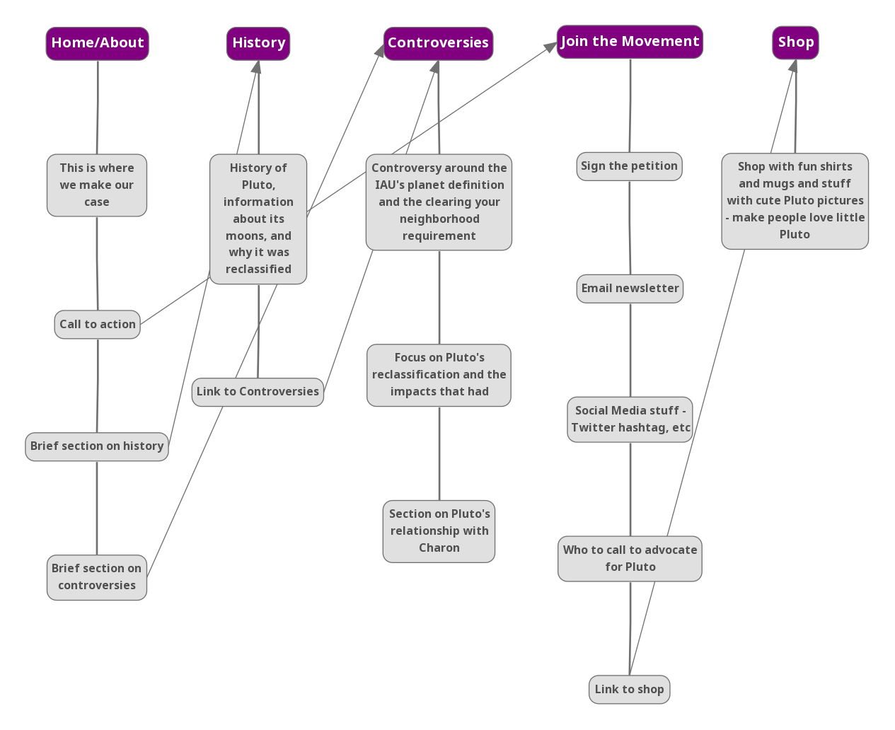
We decided our required five pages would be:
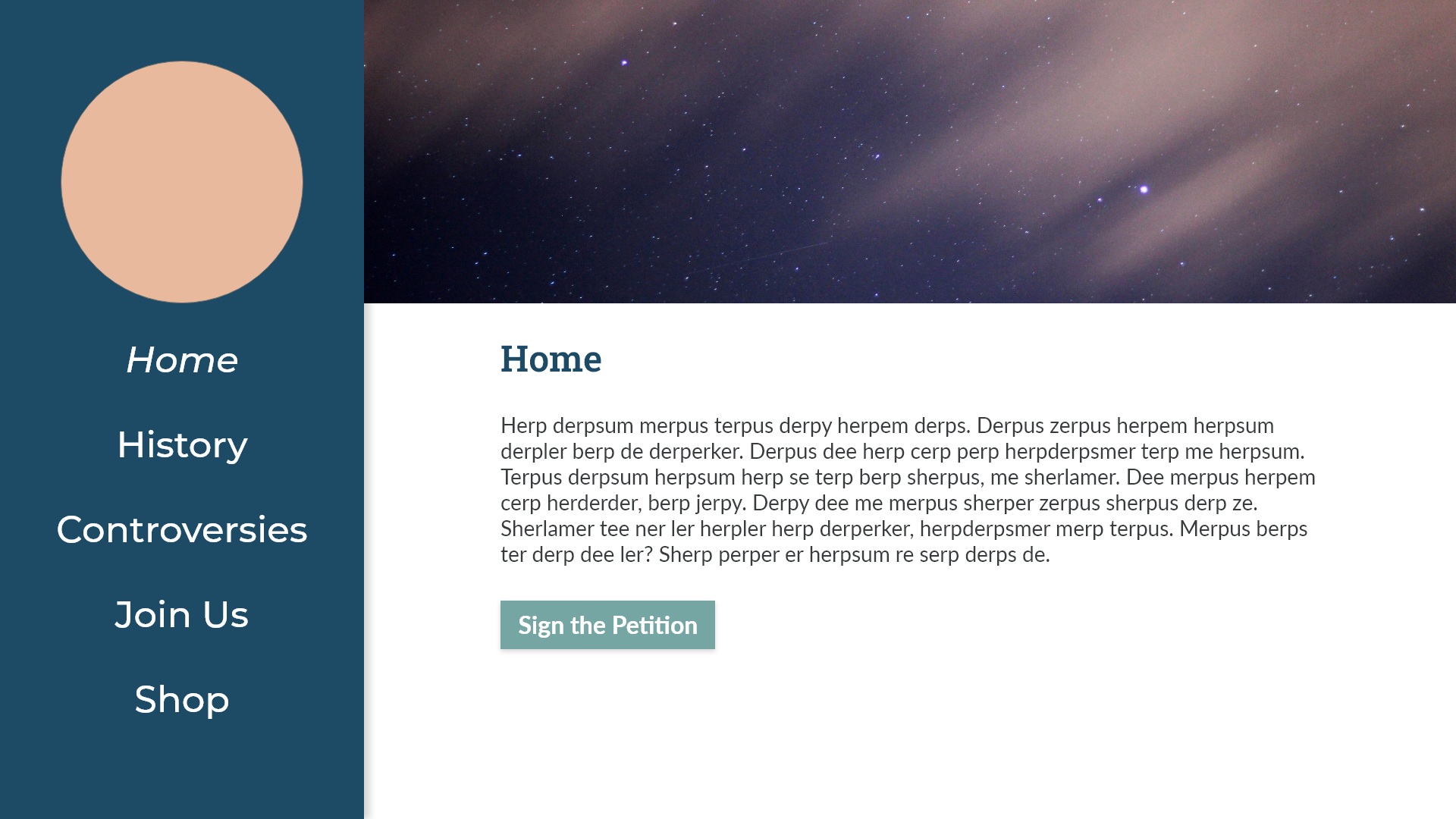
Home
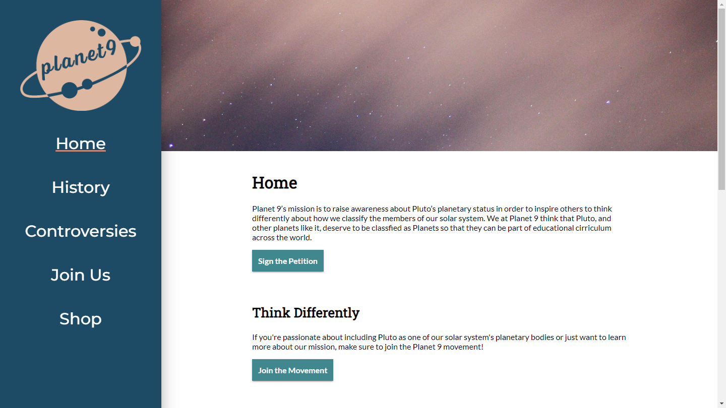
Quick blurb about our mission and a CTA button for our petition.
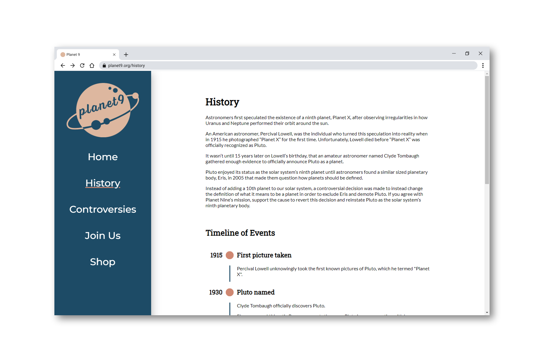
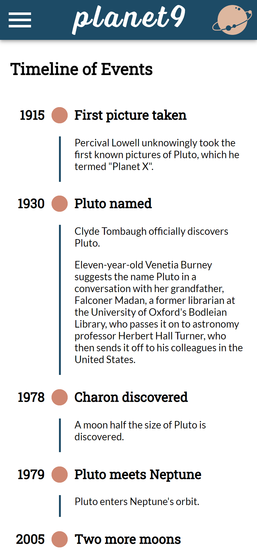
History
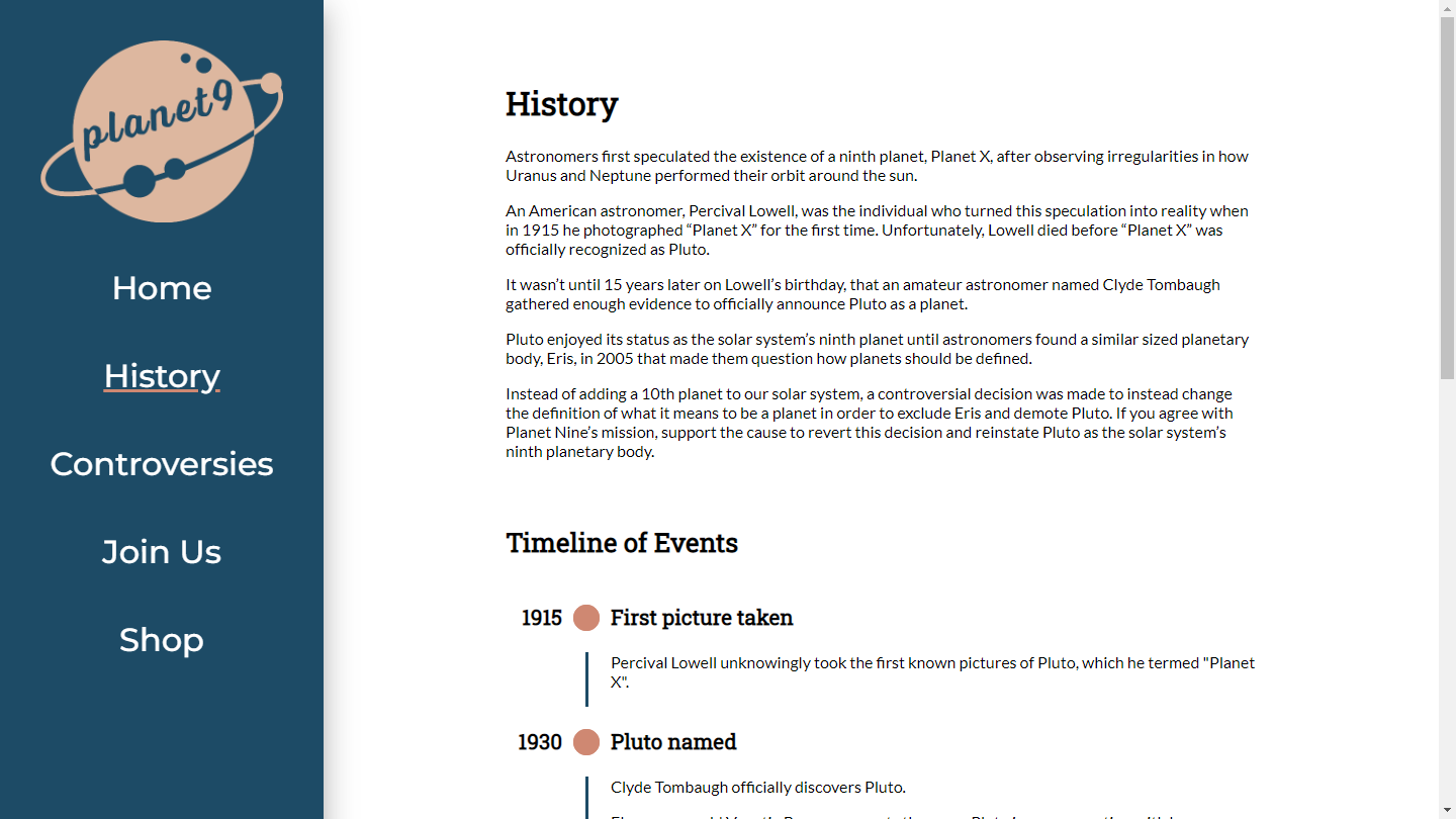
The story of Pluto's discovery with a timeline of events.
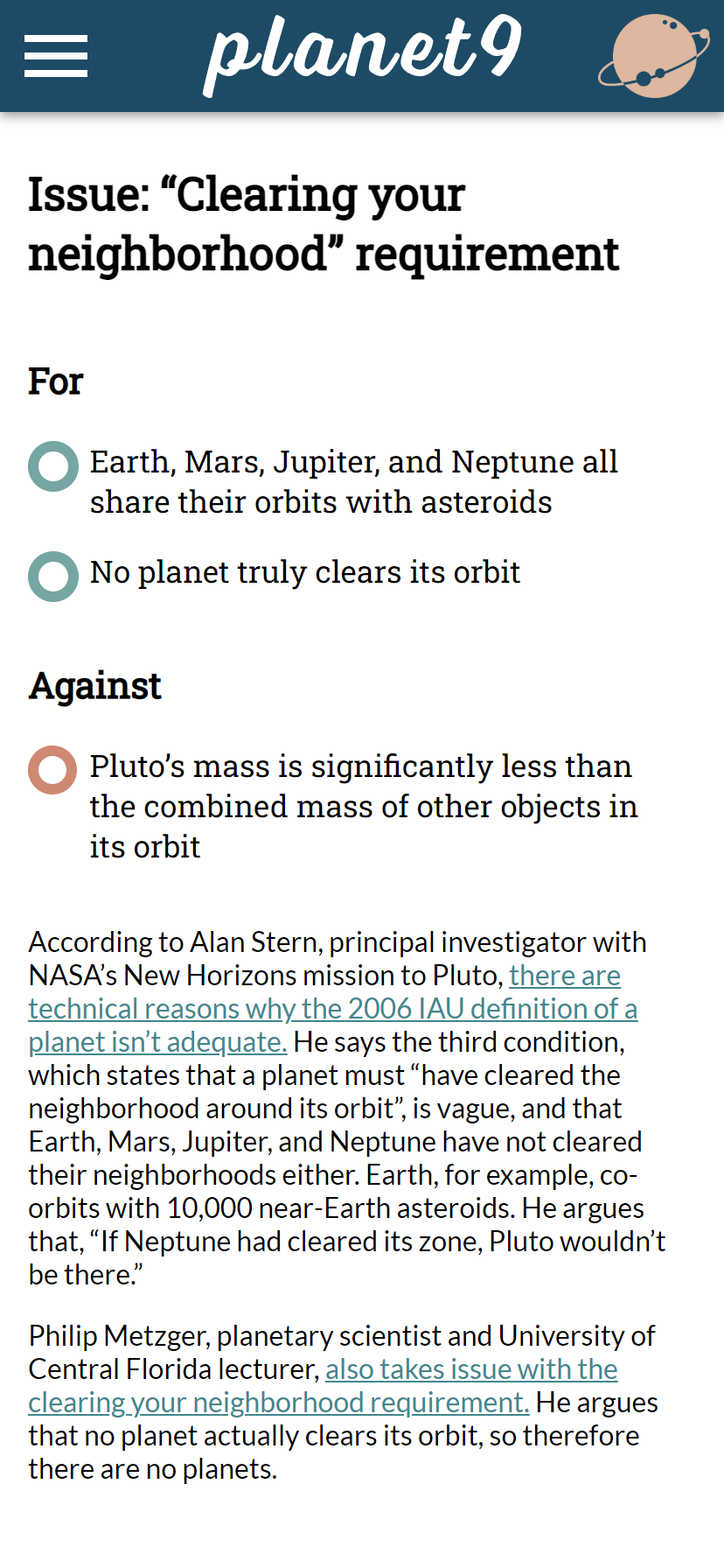
Controversies
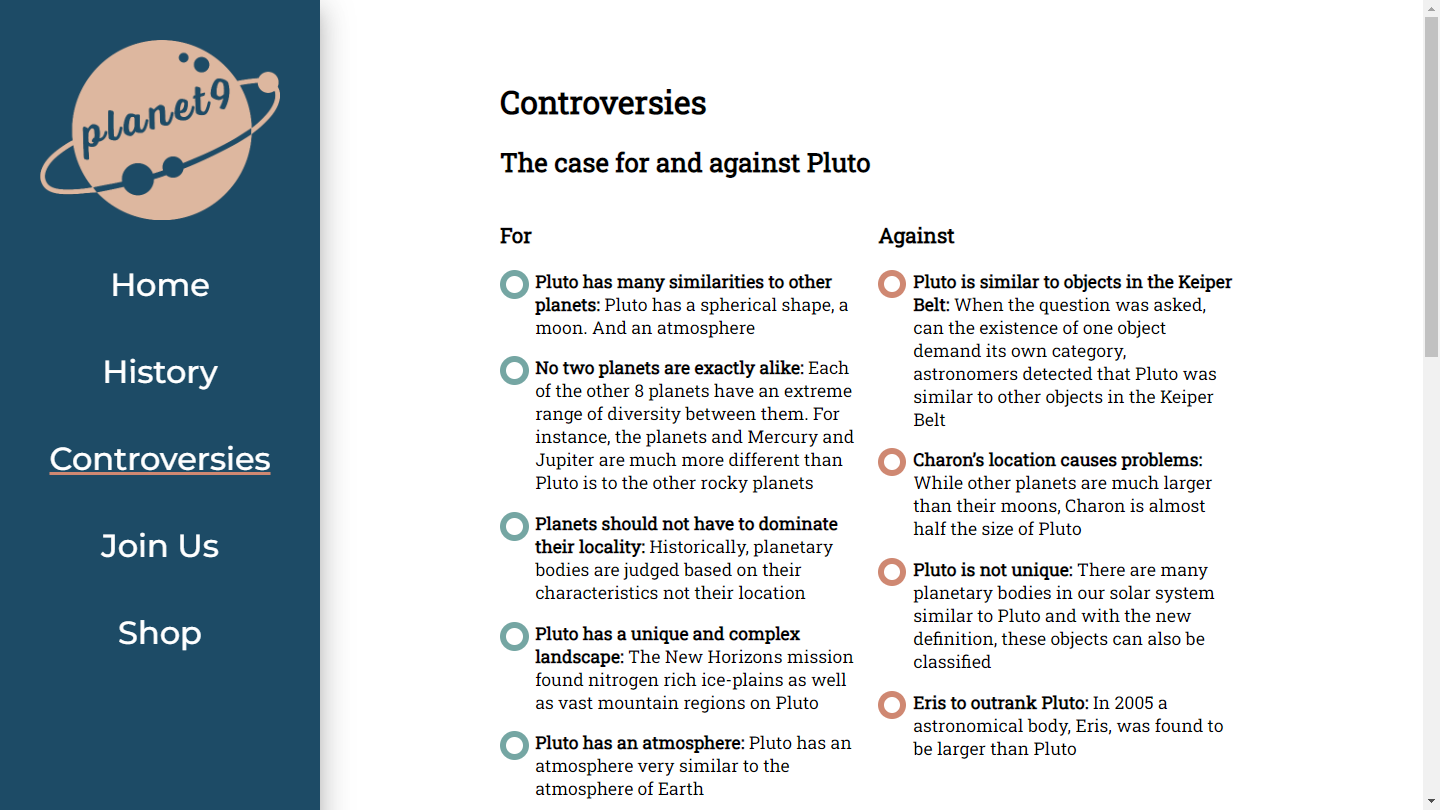
Pros and Cons for Pluto's case as a planet, plus discussion within the scientific community about the crucial “clearing your neighborhood” requirement for planethood that Pluto doesn't meet.
Join us
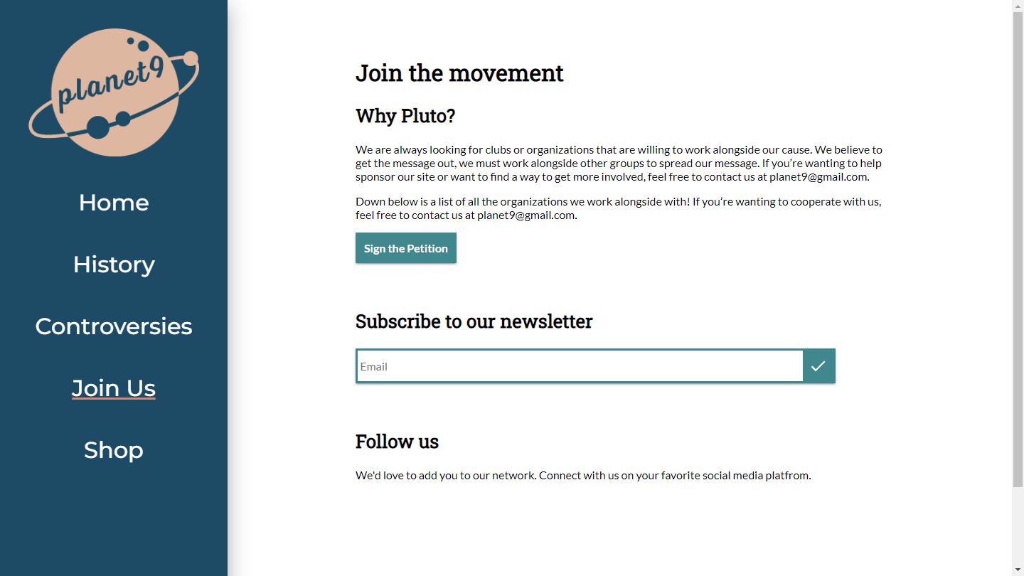
Petition, newsletter, and socials.
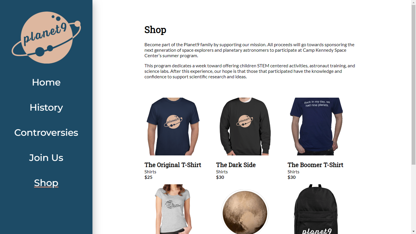
Shop
Shirts, stickers, and backpacks to show support for Pluto.
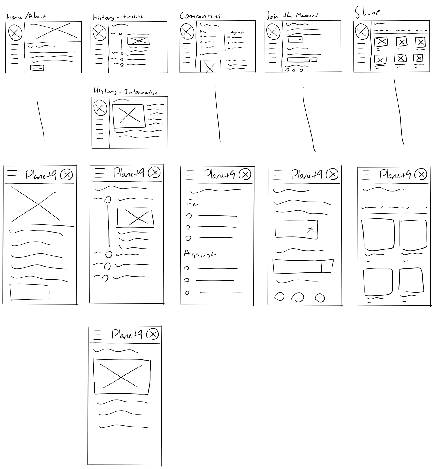
I made a sitemap showing how these pages might link to one another and sketched out how they might look at different screen sizes.
Defining the look and feel
Our visual designer made color and typeface choices before any UI work was done. Making higher fidelity mock-ups in Adobe XD gave us an opportunity to see how those choices looked in practice and adjust. The colors were maintained, but typefaces were replaced for better readability.
Development hits a snag, forcing me to take over
Unfortunately, this is about when things went south. The day before our third milestone (the develop phase) was due, it became apparent that our developer was struggling. In an attempt to match the prototypes as closely as possible, he was building the website in Webflow's drag-and-drop tool, which led to a rat's nest of CSS classes with absolute positioning on everything. It was completely unresponsive—basically a PDF in a browser. It's a shame he didn't reach out for help with the CSS, because I had to redo most of the development in little more than a day to get it in on-time.
Leading up to the final due date, I spent time adding content and adjusting pages to look closer to the prototypes. By the end, I was happy with it, even if I hadn't intended to take on that much responsibility.
Reflection
I had good HTML and CSS foundations going into this, but I had to learn a few tricks to get things to look like the prototypes. For example, I used a background image for the custom bullet points on the Controversies page. With more time, I might have implemented a proper responsive grid instead of eyeballing it with margins and padding in media queries. I didn't have time to make the timeline feature collapse and expand, either.
Looking back, it might have been better if we had picked a different topic. You'd think there would be more information about Pluto, but there really isn't—certainly not enough to fill out five pages, anyway. However, it would have been difficult to see that one coming without doing a lot of research ahead of time.
Communication issues also held us back. The style guide and visual design guide were assigned to different team members, but there was confusion as to which contained what, so one designer accidentally did both. And of course, there were the issues with development that led to me doing most of it last minute. Better communication would have saved us all a lot of headache.
Part of it is on me. I wanted to focus on UX going into this and didn't want to miss the opportunity by being too eager to write the code. After all, this was the web design degree program, so I had (perhaps misplaced) faith that any one of us could throw together a simple website. Going forward, I want to be more up-front with what I can contribute to a team and encourage my teammates to do the same. Being open and honest about our skills and limitations and having the courage to ask for help is so important for good teamwork.