Project context
Wheelies helps people with disabilities find accessible businesses
This project was done as part of a college course on user-centered design. Revisions were made later to flesh things out that had only received a surface level treatment before the deadline.
Design challenge
Design an application using user-centered design principles
Our assignment was very open-ended. A member of our team uses a wheelchair to get around and suggested the topic. We needed to do background research on our potential users and existing products, design, test, get feedback, and iterate.
My role
I was responsible for wireframing and prototyping. User testing was administered by my teammates. We all contributed to desk research.
Research insights
Discovery research included surveys of potential users and stakeholders and competitive analysis of apps that try to serve the same niche.
Wheelchair users want to know where accessible entrances are before they go
We surveyed potential users and found that many of them have had past experiences of being unable to find an entrance they could use. One respondent mentioned going in circles around a building looking for an accessible entrance before. Respondents were also excited by the idea of reporting businesses in violation of ADA rules for entrances. When it comes to how they locate accessible entrances now, respondents were split between checking pictures on something like Google Maps or simply showing up and hoping for the best. When asked how knowing where accessible entrances are in advance would help them, respondents said it would help them be on-time for appointments and special events.
Similar apps are strongly regional
We analyzed 15 existing apps that serve the same niche. We found that, generally, these apps have strong regional biases. They rely on crowdsourced data, which results in a regional feedback loop. Areas that already have some usable data will maintain and build a userbase, while other areas will fail to see adoption or opt for a competing app. Some apps even have language barriers due to incomplete localization. Wheelies would likely suffer from the same regional feedback loops. Some apps, like Accessible Dispatch NYC, realized this limitation and focused on a specific market.
Most competing apps offer only the basics
Most competing apps offer some kind of sorting and filtering of locations by category, proximity, and accessibility. Two thirds of them include contact information so users can call the business to verify accessibility.
However, less than half of competing apps allow photographing entrances or reporting inaccessible entrances. These were features that aligned with what our survey respondents mentioned using or being excited about.
Testing the competition
A teammate ran a user task analysis using the think aloud protocol with Wheelguide. In our earlier analysis, Wheelguide had a generally polished interface, though it was unique among the 15 apps we looked at in that it didn't have a map view for finding places.
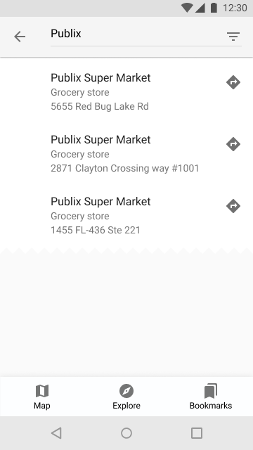
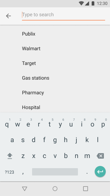
The user was asked to create an account, find a Publix grocery store and review its accessibility. She found the onboarding process to be a little clunky and the icon-based search filters were too ambiguous for her, but she was able to find the nearest Publix with a text search. She lamented the lack of a map view in search results to better judge distance from her current location. Tapping the store opened a bottom sheet with an accessibility report card rather than the store's profile, which initially confused her. The review process went smoothly, and she liked the color coding and happy face/sad face rating system.
Original exploration and design process
Tapping businesses to fill in data gaps
Most apps in this niche have small, often regional databases. One idea we had to alleviate this was to ask businesses to self-report. This data would need to be verified by users, but it would still be something where competing apps often have nothing.
The business stakeholders we surveyed agreed that considering the needs of those with disabilities was beneficial to their businesses. Accessible businesses that add themselves to our database would be promoting themselves to a customer base that may not have considered visiting otherwise.
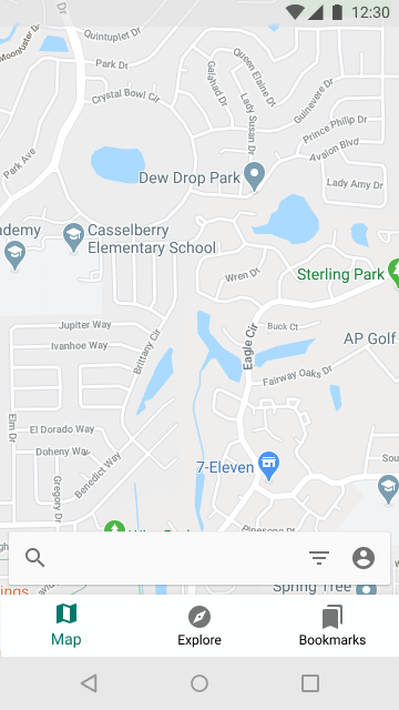
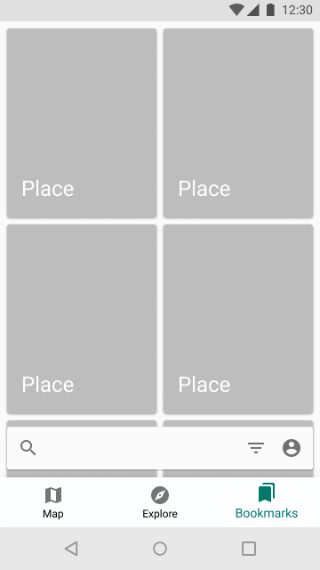
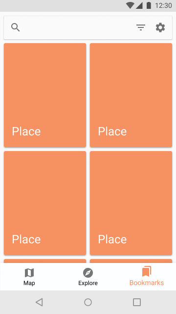
The first prototype featured a bottom search bar
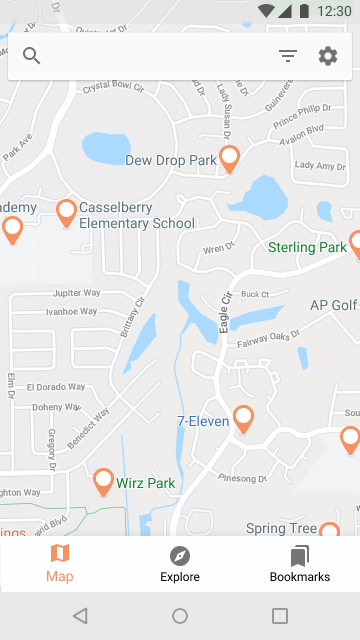
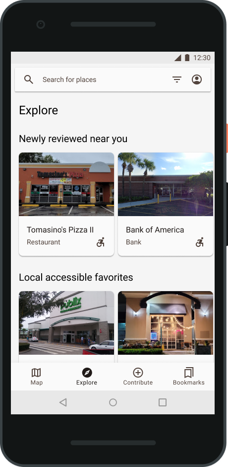
I started with a three-tab bottom app bar and a search bar. There was a Map tab, Explore tab (browse places by category), and Bookmarks tab (where users could browse their saved places). In the age of ever bigger phones, I opted to anchor the search bar to the bottom of the screen to make it easier to reach with one hand.
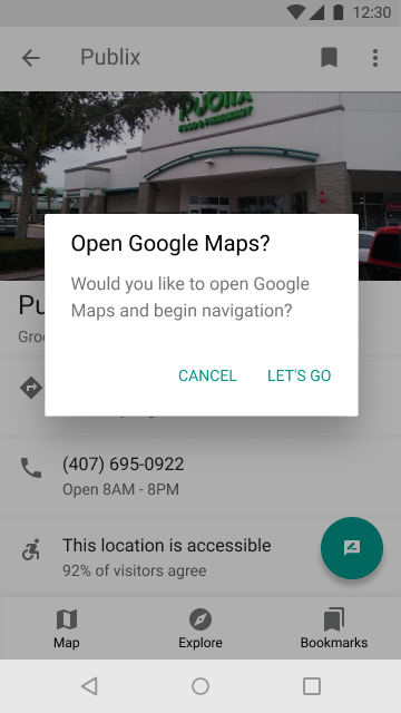
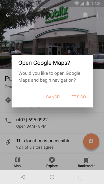
The prototype was expanded to include a search flow with a grocery store's profile page and external navigation modal.
Testing our first prototype reveals issues with search bar placement
Another member of the team tested our prototype with a new user. The goal, as with our testing with Wheelguide, was to find a nearby Publix grocery store.
The user liked the design, but initially had trouble finding the search bar and suggested the option to move it to the top. I had placed it at the bottom with good intentions, but this search bar placement subverted user expectations and made the app less intuitive and familiar. Future iterations would have the search bar at the top, where it is in Google Maps. Other than the search bar placement, the user had no trouble completing their task.
Revised prototype performs better in testing
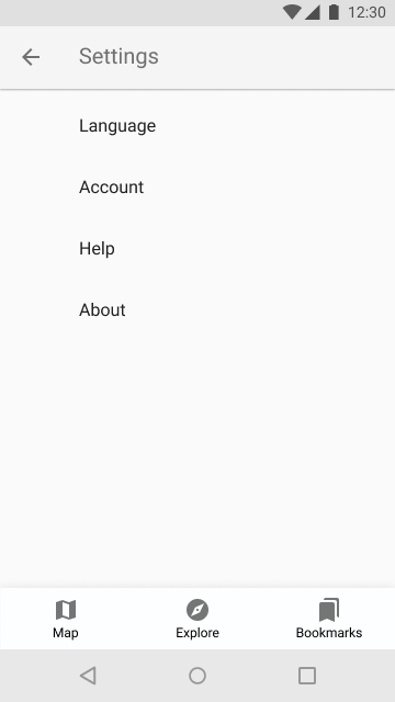
One of our designers whipped up some quick experimental designs using the original prototype, and I pulled elements of the most popular one into the next iteration. I also added a simple settings page and review submission screen.

A final user task analysis was performed with the more colorful prototype. The user was asked to find a Publix and check its accessibility rating. That went smoothly, and accessing the search screen was faster than previous iterations.
This is where things left off. Overall, our design was focused and effective. Validating our designs with user testing was incredibly valuable during this project. Relocating the search bar to a spot people can reach makes sense, but we still need to check our assumptions with testing, and the testing showed that meeting user expectations may be more important than ergonomics, at least at first.
Revisiting Wheelies
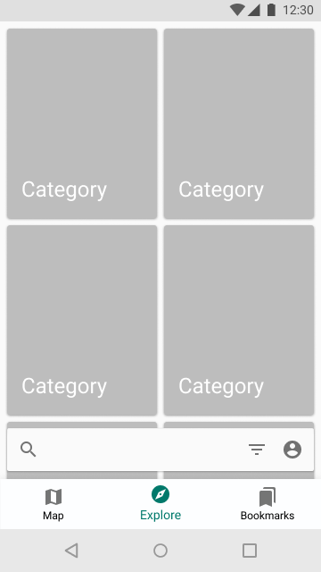
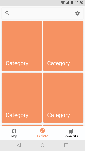
When we completed this project in school, I was satisfied with what we had done and what I had learned, but I knew there were areas in the prototype where I didn't do enough. The Explore and Bookmarks tabs, for example, were just orange rectangles with placeholder text. I wanted to go back and flesh things out and include things that we had talked about but never showed. This project had a lot of research put into it, and I wanted to honor that effort by building a prototype to be proud of.
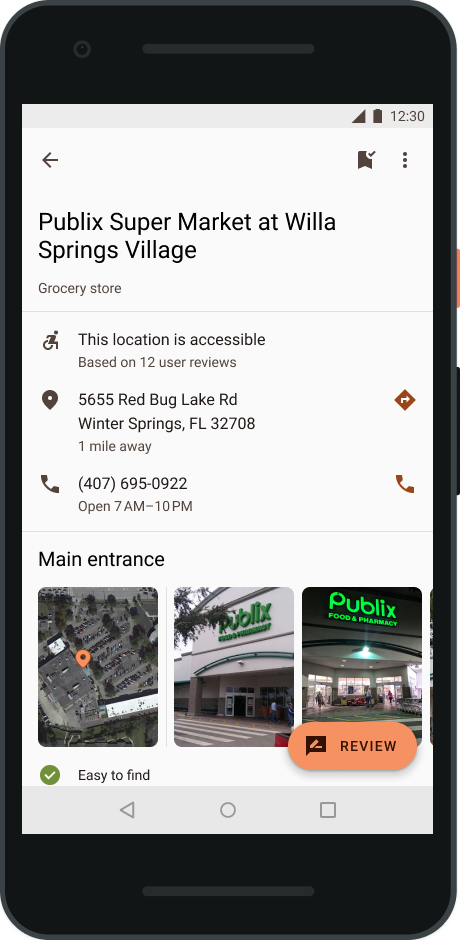
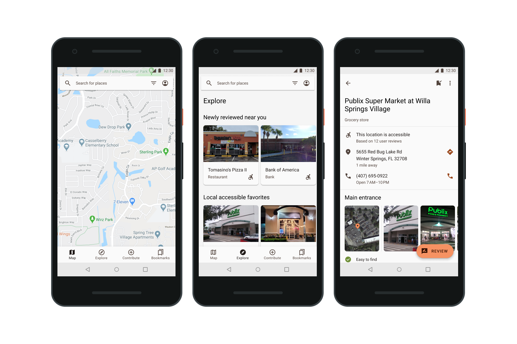
Revised place profile spotlights what our target users care about: entrances
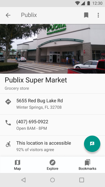
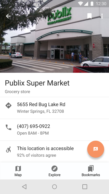
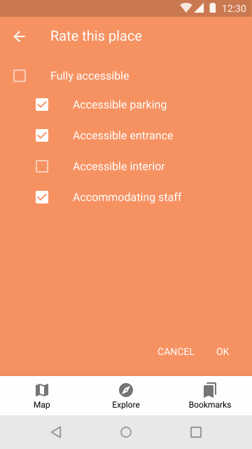
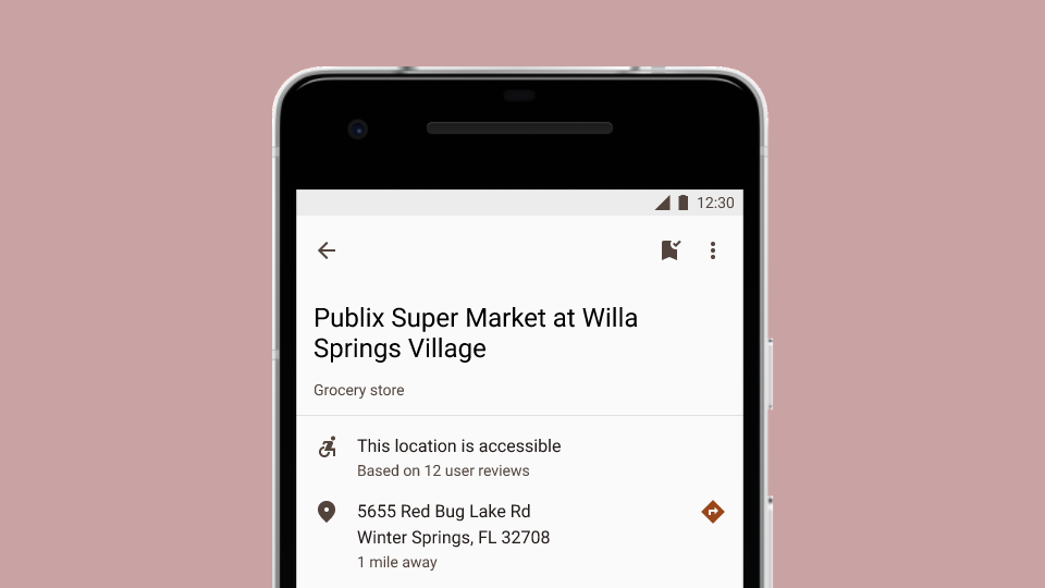
The original prototype had a very barebones representation of what a location's profile page might look like. It had a picture, title, category, address, phone number, operating hours, and accessibility rating.
Early in the project, much of the focus was specifically on helping people find accessible entrances. We had also discussed including user comments so folks could give others a heads up for anything that might give them trouble. Neither of these features were properly demonstrated in the prototypes. These oversights have been addressed.
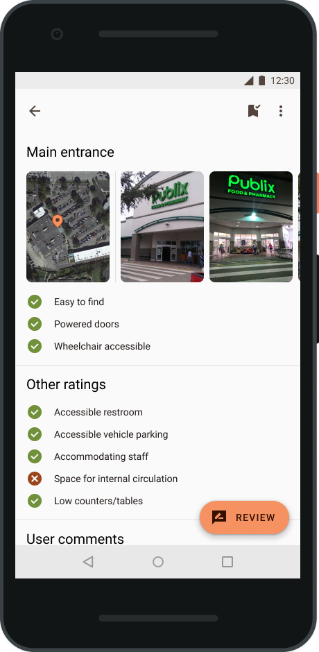
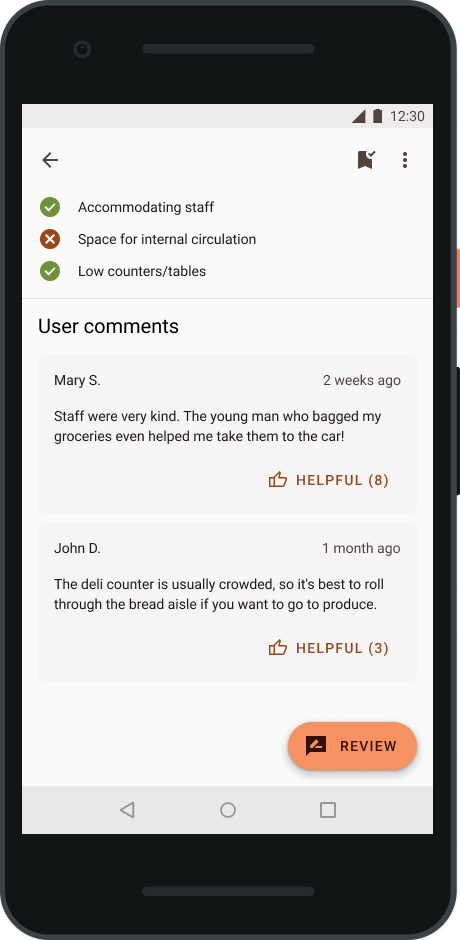
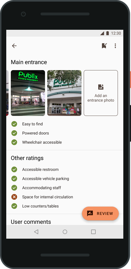
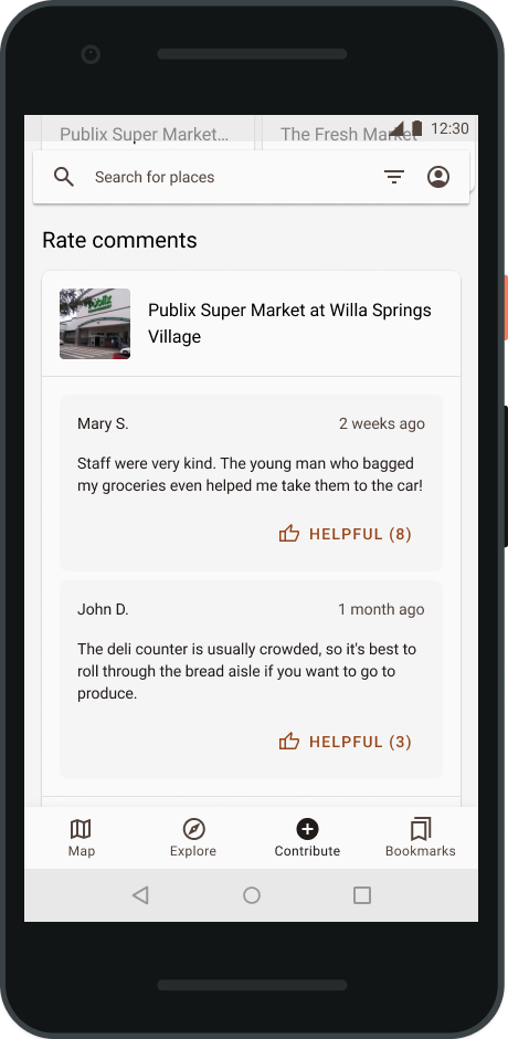
Now, there's a satellite map with a pin over the main entrance, plus a row of user photos from ground level. I also fleshed out the accessibility rating details, which now includes a checklist of the features from the review process. A comments section follows with notes from reviewers, which users can mark as helpful.
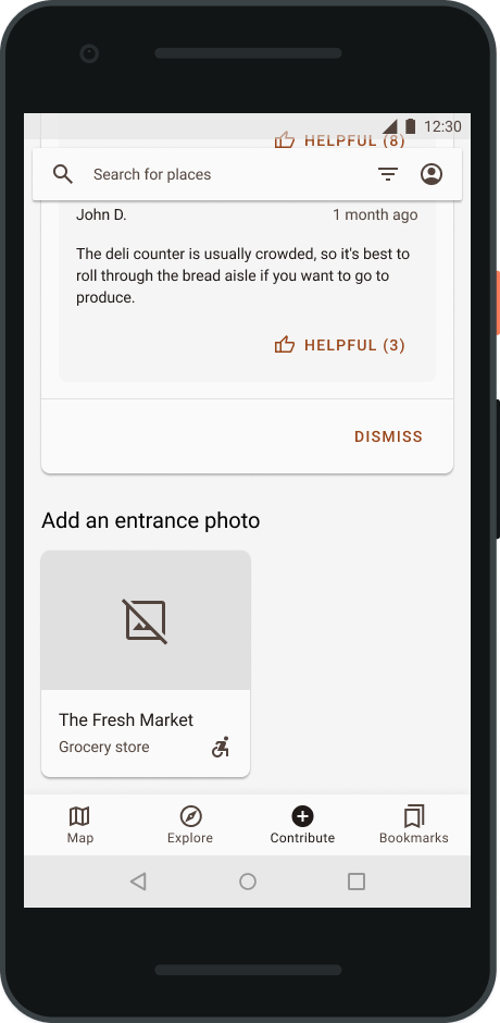
The overflow menu is where the edit and share options live, as well as options to report inaccessible entrances and for business owners to claim their locations for self-reporting. At the end of the entrance photo row is a button to upload another. By tucking it at the end, it would make an appearance only when the available photos haven't satisfied the user.
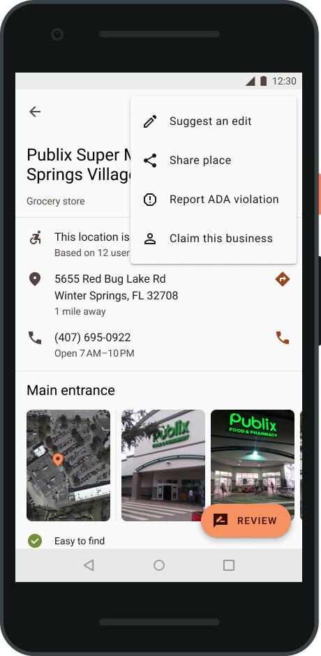
The top bar also gets a less ambiguous bookmark button and no longer coexists with the bottom navigation bar, which had a similar icon for the Bookmarks screen. This was a minor source of confusion in user testing. When a place hasn't been bookmarked, it has a little plus sign at the top right corner. When a place has been bookmarked, it changes to a small checkmark.
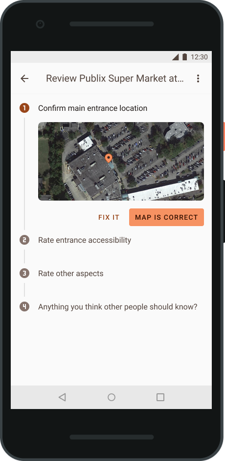
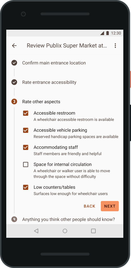
Reviews expanded and refocused on the main entrance
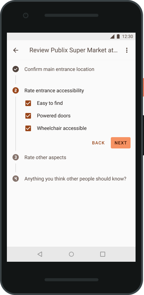
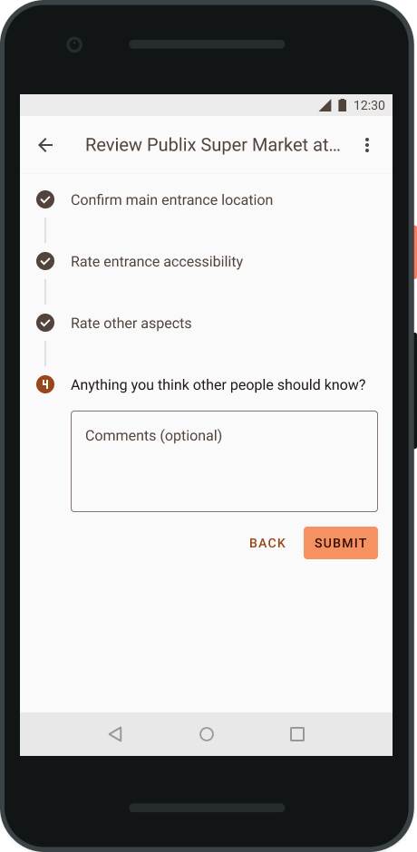
The review process now has more of a focus on the main entrance. Users are asked to confirm the point on the map where the door can be found and to rate whether the entrance is easy to find, has powered doors, and is wheelchair accessible. The other ratings have also been expanded upon with more descriptive titles and help text. Taking a cue from Wheelguide, the “accessible interior” rating has been split into “space for internal circulation” and “low counters/tables”. Finally, there's an optional section for comments so folks can add details they think others would like to know before they go.
Expanded Explore and Search screens
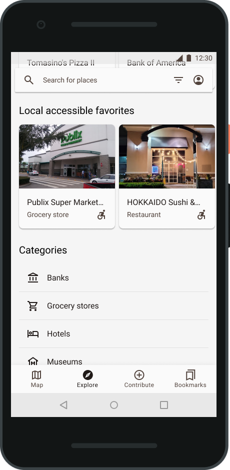
Explore now includes location-based recommendations
Unlike Google Maps, Wheelies wouldn't have a user's location history to tailor business suggestions, so I opted to use current location to surface nearby places that have recently received accessibility reviews, as well as local places with highly positive ratings. These sit in their own horizontally scrolling lanes, and the list of categories follows.
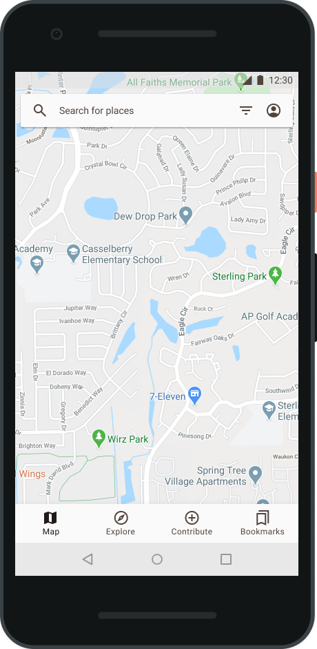
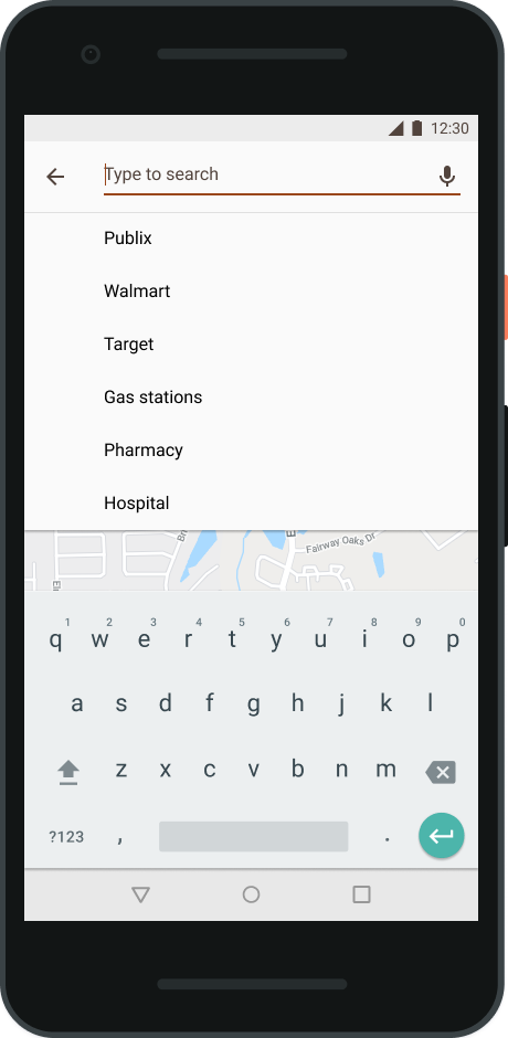
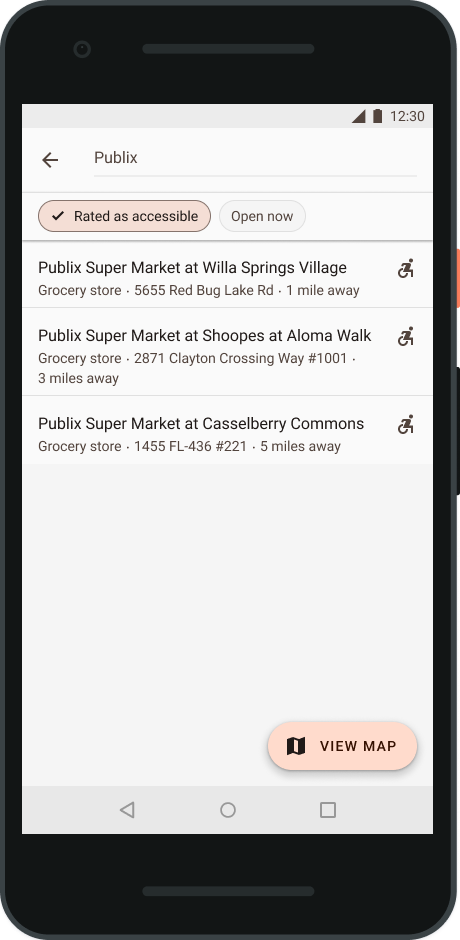
Updated Search experience daylights filters and adds map view
Search filters have been brought out into the open and sit above the list of results. Places rated as accessible get a wheelchair icon, so users can find good places at a glance. A floating action button lets users see their results on a map to make it easier to judge real distances.
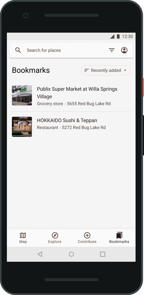
The Bookmarks tab lets users quickly revisit their favorite spots or save new ones for later
The list can be sorted by date added, name, or distance.
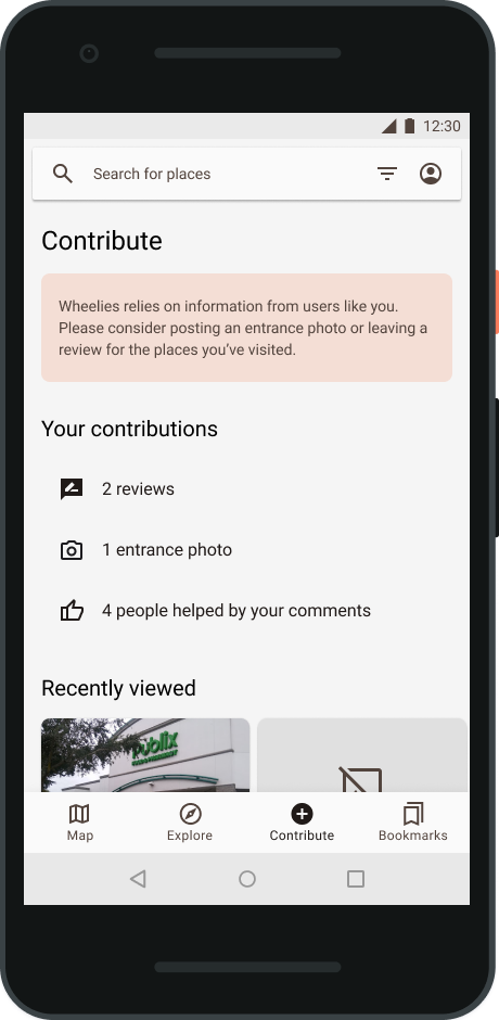
Facilitating vital user contributions
An app like Wheelies needs information from users to provide value. The Contribute tab (not included in prior designs) encourages users to post entrance photos and to review the places they've visited. The top of the screen features the user's contributions so far, such as the number of reviews they've posted or the number of likes their comments have received.
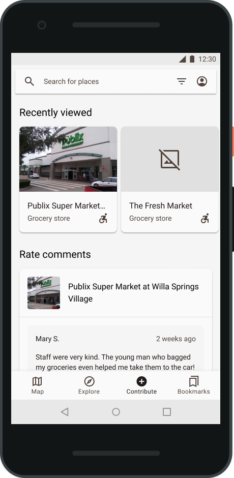
It surfaces places that a user has recently looked at in the app, as well as comments from other users about those places. Once the user visits those places, they can quickly rate the comments that were helpful and tap into the profile to review the location's accessibility. Another section asks users to add entrance photos for places that don't have any.
Increased contrast across the board
The original prototype had plenty of interactive elements that didn't meet standards for accessible contrast ratios. These mistakes have been fixed. Buttons, icons, and navigation tabs all have higher contrast color choices that should make them easier to read.
Prototype
Screenshots not enough? I also made a click-through prototype.
Reflection
This was fun to come back to. I could have left things as they were. It was good enough for the class. I think we got a 100% in the end, since the project was far more about the design process rather than the outcome. However, I didn't want to put myself in the position of presenting this project in an interview and getting to the Explore or Bookmarks tabs and being like, “Ta-da! Here's the part where I didn't even bother!”
I care about the quality of my work. My portfolio is meant to be a showcase of how I approach a problem and what I can do, and the work we turned in at the end of the semester during a plague wasn't a great reflection of that.